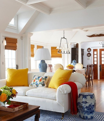
Temperature sense
In color science, the colors of different hue are divided into hot, cool and warm colors, from red purple, red, orange, yellow to yellow green, called hot color, and orange is the hottest. It is called cool color from cyan, green to blue, and the coldest to cyan. Purple is a mixture of red and cyan, green is a mixture of yellow and green, so it is warm. This is consistent with human long-term sensory experience, such as red, yellow, people like to see the sun, fire, steel furnace, etc., feeling hot; and cyan, green, people like to see the rivers and lakes, green forest It feels cool. However, the color of the cold and warm is both absolute and relative. The closer to the orange, the hotter the color, the closer to the cyan, the colder the color. If red is cooler than red orange, red is hotter than purple, but it cannot be said that red is cool. In addition, there is also the influence of color, such as small white and large red, white is obviously green, that is, the effect of red complementary color is added to white.

Color symbolism
People show different likes and dislikes for different colors. This kind of psychological reaction is often caused by people's life experience, interests and associations caused by color. In addition, it is also related to people's age, personality, literacy, nationality, and habits. open. For example, seeing red, reminiscent of the sun, the source of all things, and thus reverence, greatness, can also associate with blood, feeling uneasy, barbaric, and so on. Seeing the yellow-green, the plant sprouts and grows, feels the coming of spring, so it represents youth, vitality, hope, development, peace and so on. Seeing black, I think of the black yarn in the night, the funeral, and thus mysterious, sad, ominous, desperate and so on. Seeing the yellow, it seems that the sun shines on the earth, and it feels clear, active and excited. People's judgments about color, from subjective association to experience, and then to rational judgment, have both universality and particularity; they have both commonality and individuality; both inevitability and contingency, although they have the correct side, Not confirmed by science. Therefore, when we choose color as a certain symbol and meaning, we should analyze it according to the specific situation, and we must not do whatever we want, but it does not hinder the generalization of different colors.
Color can make people feel the difference between advancing and retreating, bump, and far and near. Generally, the warm color and high brightness have the effect of advancing, protruding and approaching, while the cool color and the lower brightness have the effect of retreating, recessing and moving away. . These characteristics of color are often used in interior design to change the size and height of the space.
Sense of scale
The effect of color on the size of an object, including both hue and lightness. The warm and bright colors have a diffusing effect, so the objects appear large, while the cool and dark colors have a cohesive effect, so the objects appear small. Different brightness and cold and warm are sometimes shown by contrast. The different furniture and objects in the room have a close relationship with the color processing of the whole indoor space. Color can be used to change the scale, volume and space of the object, so that the interior parts The relationship is more coordinated.
Red is the strongest and most vibrant color of all colors, and it has the power to strongly draw attention and seem to override all colors. It is blazing like fire, magnificent like the sun, passionate and bloody, is a symbol of the lofty life. The human eye crystal has to adjust the focal length to the red wavelength, and its natural focus is behind the retina, thus creating a visual illusion that the red object is moving forward and closer. These characteristics of red are mainly manifested in the effect of high purity, and when their brightness increases to pink, they become dramatic, gentle and feminine.
Green is a symbol of the growth of life, the vitality of life, and the power of nature in plants. Psychologically, green is calm and relaxed and rested. The human eye crystal concentrates the green wavelength on the retina so it is the color that makes the eye rest.
Blue is red in all respects, blue is transparent and moist in appearance, red is opaque and dry; psychologically blue is cold, quiet, red is warm, excited In character, red is rough, blue is high; for human body, blue reduces blood pressure, red increases blood pressure, blue symbolizes quietness, freshness, comfort and contemplation.
Orange , orange is softer than the primary red, but bright orange and orange are still stimulating and excitatory, light orange is pleasant. Orange often symbolizes vitality, fullness and friendship, and it does not actually have negative cultural or emotional associations.
Yellow and yellow are the highest brightness in the hue ring. It is radiant, light and bright, full of vitality, warm, pleasant and refreshing. It is often a symbol of positive, progressive, civilized and bright, but when it is When it is cloudy, it will show morbidity and disgusting.
Camp Parts,Camping Fire Stick Rod,Fire Starter Stick Survival,Camping Fire Starter
BaoJi JiaXin Nonferrous Metal Co., Ltd. , https://www.jiaxin-ti.com